Thursday, September 30, 2010

OrangeFolds Logo

Another concept application logo design.
This time for Apple Ipod. As the tagline says "its not Apple anymore". OrangeFolds replaces the Apple iTunes and the makes some firmware changes for the iPods and makes it much more than a mere iPod adding more features, and being alot user friendly.

Click to Enlarge image:


Find it here:

Tuesday, September 28, 2010

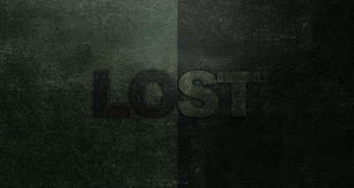
LOST Typography!

"LOST... Where the fine Line between REAL and UNREAL fades..." Ah Whatever!
LOST is the second of my Typography and I hope to do alot more.

Done, with inspirations from LOST (series) oozing from last night, and an accidental design concept from a recent design tip acquired from vipindhanurdharan.
This was unexpected, unbelievably done in minutes and for me it looked inexplicably good...leaving me with an unquenchable thirst to design more!
This LOST piece could be considered a fan art piece for LOST Series coz I have been seeing a lot ot recently. OR it could just be visual...as the subtitle suggests...'LO' & 'ST' is LOST in between the fine line that defines REAL & UNREAL. Choose what you may.... :D

Click to Download the
HUGE version.

Find it here:


I Love GOTHAM

I know I have been over-using Gotham font alot.
Browse through my Gallery and you'll know yourself.
But what can I do?

I LOVE GOTHAM!
It all started with INCEPTION. I started noticing how beautiful the Gotham font was...then I went over to seeing it all over the net. Somehow Gotham was considered the new Helvetica. I saw the font extensively used, mostly on movie posters of Gran Torino, Invictus, Hereafter (all the 3 movies are directed by Clint Eastwood and the posters designed by The Cimarron Group. Ever since that I have been in love with the font. Somehow it made the design look cool just adding the font.
Many people still live in the Helvetica era and I havnt seen much people using Gotham...either coz they dont like it better than Helvetica or maybe its paid and rare to find
The Color pun is intended deliberately! (Guess what the PUN
is?)
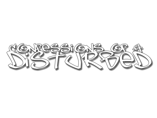
This is my very first typography.
Click the image to ennlarge:

Inspired by this cool piece of Typography by alesfuck

Find it here:


Friday, September 24, 2010

sideRoots

Random logo design.
sideRoots. :D


Find it here:


Thursday, September 23, 2010

Vulcan Salute: A Star Trek Minimalistic Wallpaper

I always had been a Star Wars fanboy. Though that was until I saw J J Abrams' Star Trek and wow I was blown away. The movie was extremely good and 2 weekends back and I bought the DVD and saw it again and went through the extras and stuff and I thought I gotta do something as a tribute to Spock Prime.
I still am more affined to Star Wars than Star Trek but its never a rule not to love both movie series simultaneously. Both series has its own ups and downs...(Hayden Christensen being Darth Vader and making Vader as a Pussy...being the worst).

Click for Full size


Find it here:


I Quit!

This is for all ye' fellow smokers out there!
By far the roughest work I've done! and Barely took 10 minutes.


Find it here:


True Blood Minimalistic Wallpaper

When I first heard of True Blood, I thought it was just milking dry the vamp craze that Twilight had started...So I thought it'd be just another vamp-romance-chick-flick. Though when I finally started seeing it a few months back, I was dumbstruck at how the story and direction made the series so engrossing and immersive.

True Blood is the perfect mixture of thrills, chills and penultimate fantasy any guy could wish for.
Although True Blood minimalistic posters and wallpapers are abundant...this is my contribution for one of the top rated series of this time.

True Blood and Everything associated to the series are all properties of HBO

Download for Full Size Wallpaper!


Wednesday, September 8, 2010

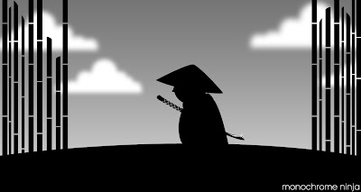
Monochrome Ninja

'Monochrome Ninja' is the by-product of a long-brooded concept.
This is just a doodle of that idea...tried to make it as simple as possible and for a work of under 20 minutes I suppose it looks good. Done in Photoshop CS4...I wanted it to look vectorish thus the plain bamboo designs and sharp edges.
By the way the color scheme is obviously inspired from LIMBO. So no hatemails...LIMBO fanboys!
I might do a full fledged digital 'Monochrome Ninja' sometime soon...and I have a pretty good idea of how to revamp MC.
Inspirations: Genndy Tartovky, Samurai Jack, Mini Ninjas & Limbo.

Find it here:


Friday, September 3, 2010

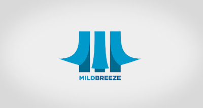
MildBreeze Logo

So once again I've started churning up Logos.
MinBreeze started out, as, always a sketch. It was one fine morning and I had nothing to do here at office. IDK why...Office is such a good place to think and churn stuff up...Creative/Destructive and maybe even Perverted :P.
So I just thought about breeze flowing through the windows and thought about how I could represent it visually and minimally. Couldnt figure out a way so I just started on another logo design and then things started goin the breezy thing again and within 10 mins or so MildBreeze logo was ready! WHOA! And it looked good for such a short time of 10mins. Fiddled with it more and tweaked some nice colors. Added the typo with Gotham Black (Yes, again, Toldya I am in love with that font, he he).


Find it here: