

Browse through my Gallery and you'll know yourself.
But what can I do?
I LOVE GOTHAM!
It all started with INCEPTION. I started noticing how beautiful the Gotham font was...then I went over to seeing it all over the net. Somehow Gotham was considered the new Helvetica. I saw the font extensively used, mostly on movie posters of Gran Torino, Invictus, Hereafter (all the 3 movies are directed by Clint Eastwood and the posters designed by The Cimarron Group. Ever since that I have been in love with the font. Somehow it made the design look cool just adding the font.
Many people still live in the Helvetica era and I havnt seen much people using Gotham...either coz they dont like it better than Helvetica or maybe its paid and rare to find
The Color pun is intended deliberately! (Guess what the PUN is?)
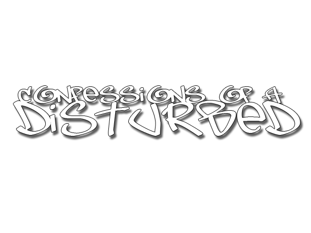
This is my very first typography.
Click the image to ennlarge:

The Color pun is intended deliberately! (Guess what the PUN is?)
This is my very first typography.
Click the image to ennlarge:


No comments:
Post a Comment